Red Hue Instagram Series
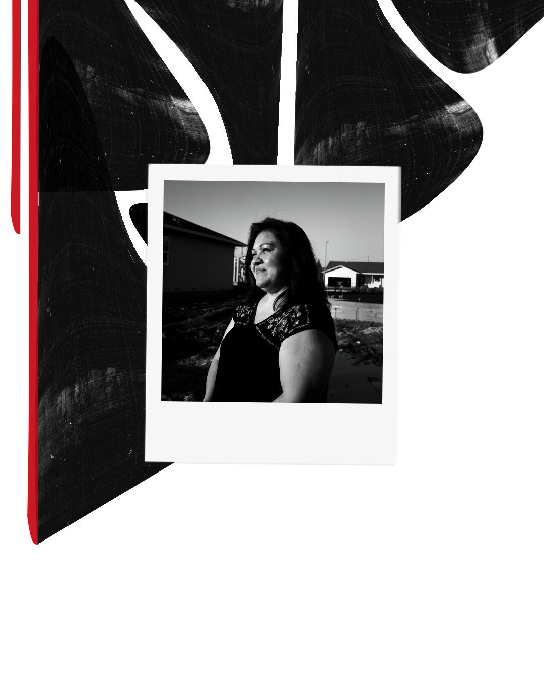
In an era where the frequency and intensity of wildfires are rapidly increasing, Red Hue is a series dedicated to better understanding those who have been directly or indirectly affected by wildfires. Red Hue takes a dive into the stories of survivors, volunteers and solutions providers of Northern California wildfires, each post spreading awareness on how to help better.
Softwares Used: Adobe Photoshop
Touchpoints: Project Management, Design Research, Photography, and Graphic Design
Mockup Credit: mockupworld
Client: Personal Project
Year: 2018-2019
Location: Northern California and Virtual
Team: Abigail Tehusijarana, and Kasey Djongroaminoto
The Process
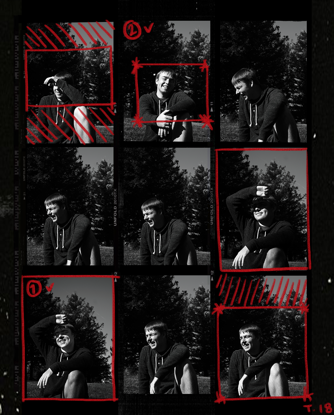
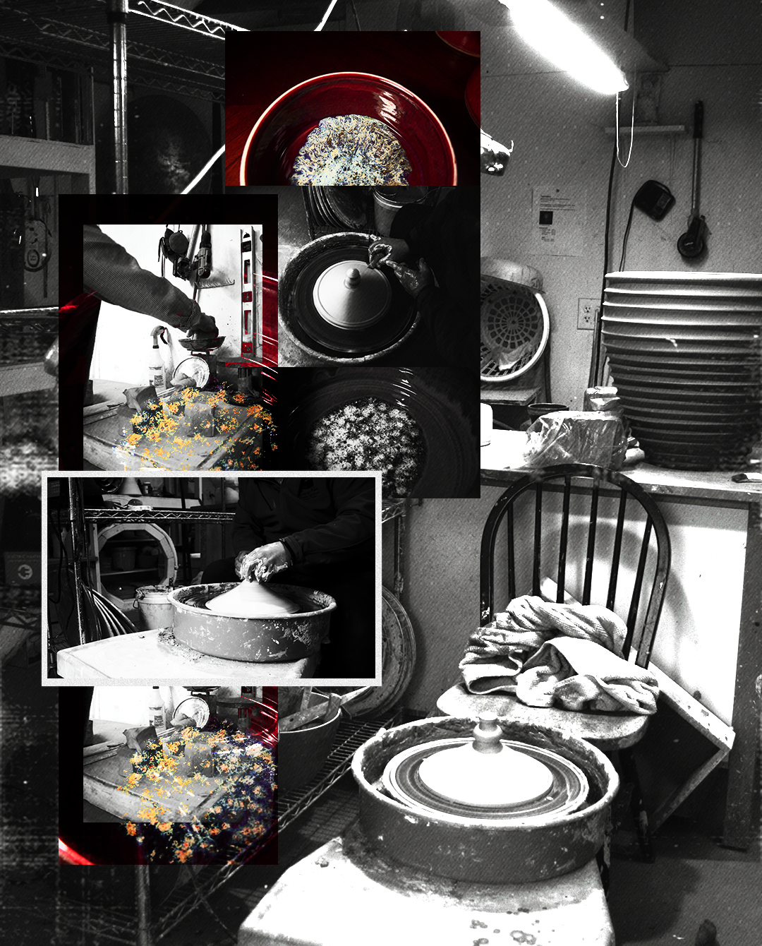
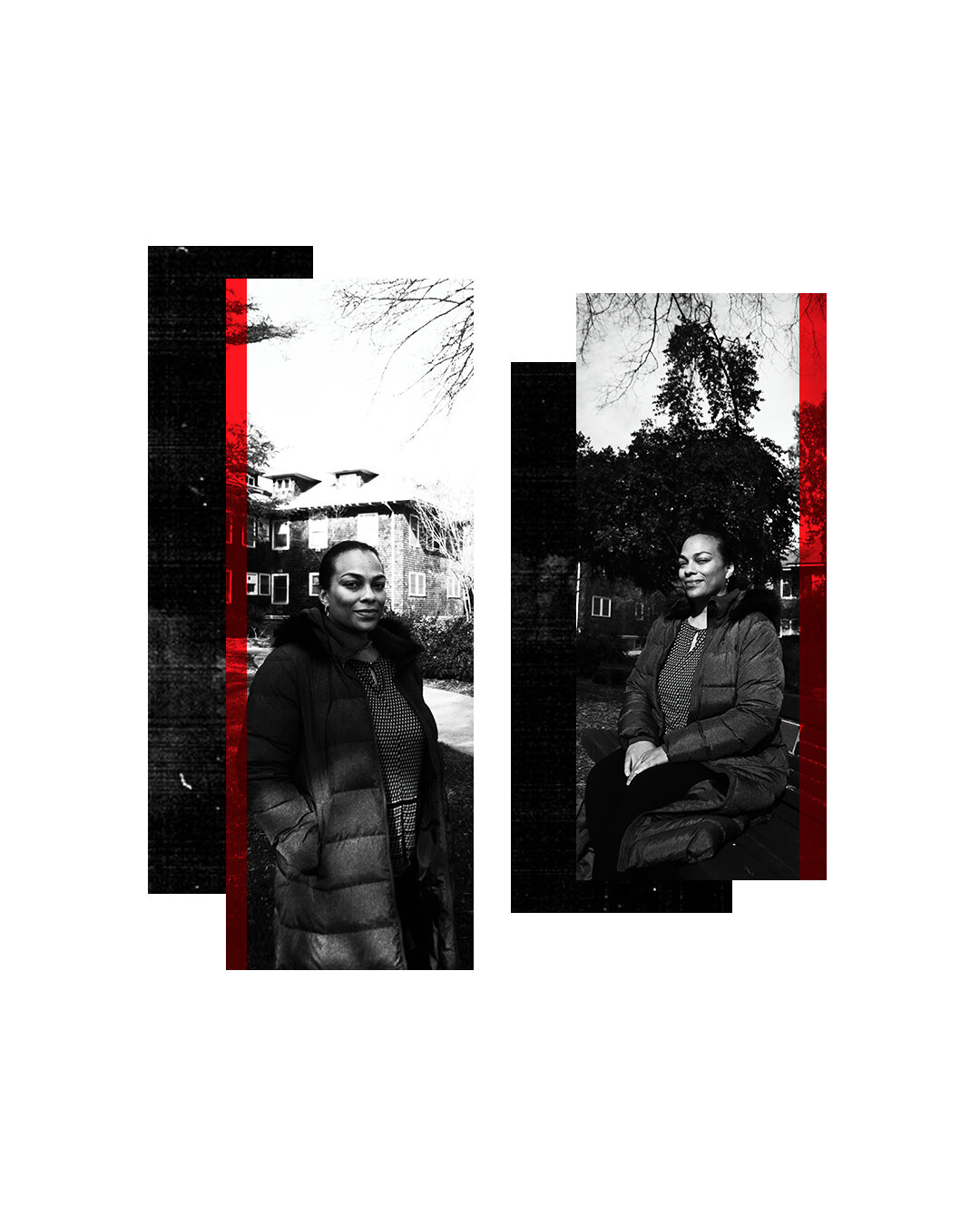
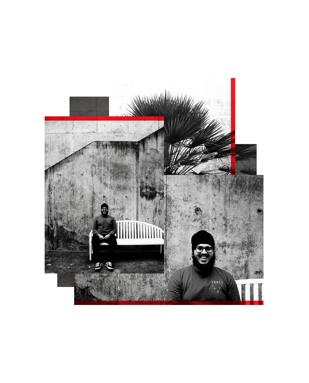
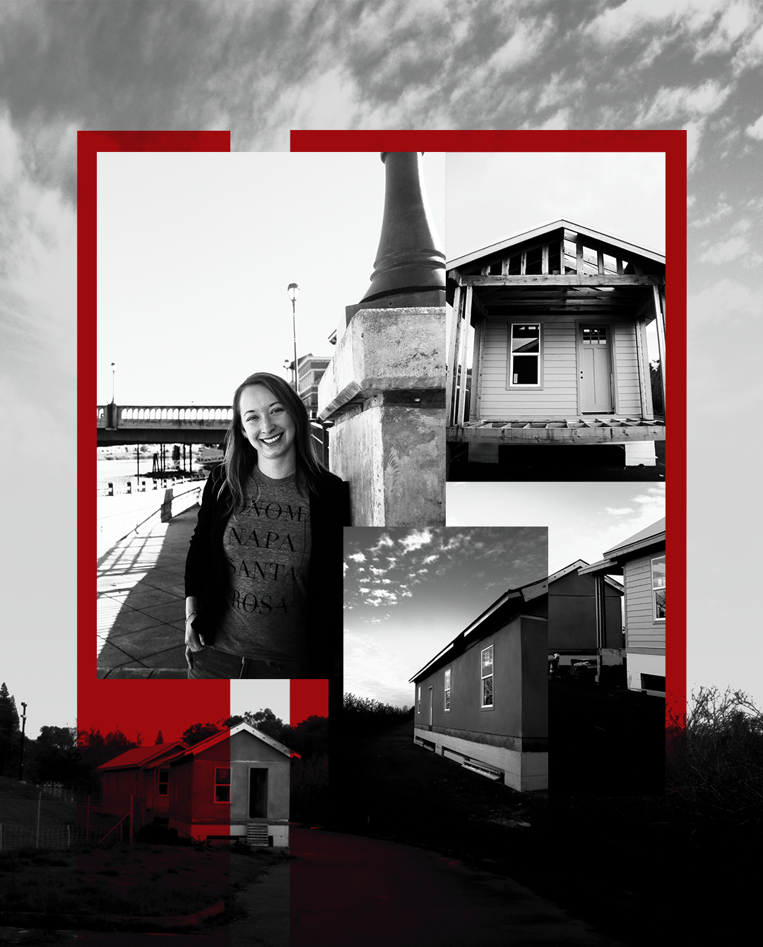
“How do we best help survivors of California wildfires?”— that was the question that began Red Hue. In a span of four months, I cold emailed people who fell under 3 categories: survivors, volunteers and solution providers. Once the 6 interviewees were finalized, we had coffee, unpacked their experiences, learned from each other, and took photos that helped express their
stories. In our design process, I set the framework for Kasey and I to work on each piece— one that ranged from the vibe and style, to grid planning. Abigail, on the other hand, listened to our recorded interviews and wrote captions for each post. Once we were done, we sent each post to our interviewees, and once they’ve given the go, we posted them.
